MAILCHIMP
Brand Redesign
Redefining a beloved brand with a wink
Mailchimp started out as the friendliest email marketing platform in town. As they expanded to more sophisticated services, they needed a brand tone that reflected that growth while staying true to Mailchimp’s….Mailchimpy-ness.
In a category rife with clichés, we needed to stand out to small business owners who don’t know the first thing about CRM analytics optimization. We created a direct-yet-friendly way of speaking to our customers and paired it with an editorial design style that bucks industry trends.
From a full website redesign to a 360 launch campaign, the results were a perfect concoction of whimsy that worked hard.
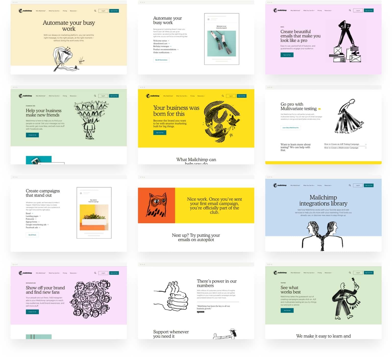

Un-blanding the basics
Our design target, creative entrepreneurs, prefer to spend their days focused on what they’re selling, not how to get people to buy it. As such, marketing can seem like a chore instead of the magical money-making machine it really is. We wanted to show up in a way that grabbed their attention through elevated design and plainspoken language that respected their intelligence and their time.

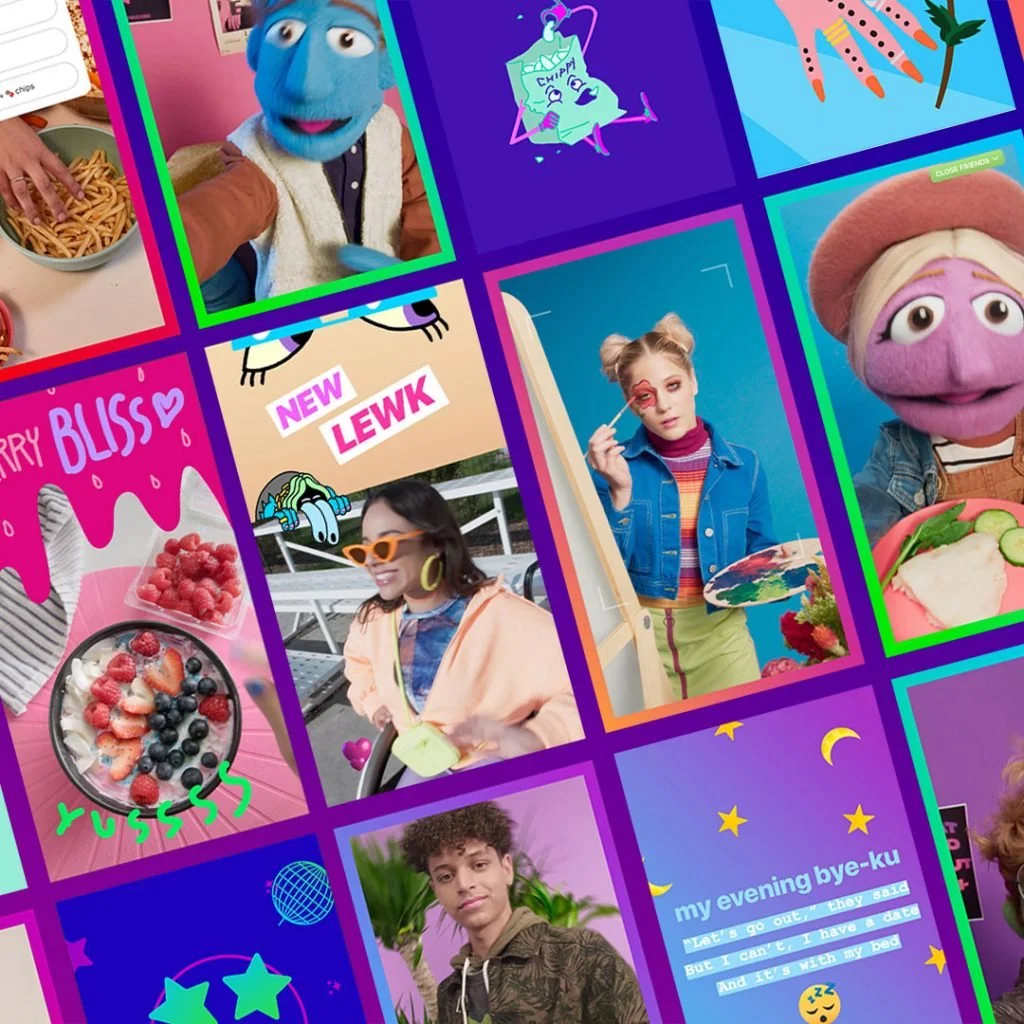
Stand-out illustrations
No cliché imagery here — in its place is a suite of eclectic illustrations created by female artists from around the globe. It turns out that when illustrators who aren’t marketing experts bring their own interpretation to textbook marketing concepts, the results are unexpected and delightful.


360 launch campaign
To celebrate the new brand, we launched a campaign that would tell Mailchimp’s story to the world. The biggest roadblock to convincing customers that Mailchimp does more than mail? The word “mail” is right there in the name. We tackled this inconvenient reality head on—and turned outgrowing your name into the ultimate sign of success. That signature Mailchimp yellow could even be seen miles away from the 1 World Trade Center observatory.


GREATEST HITS